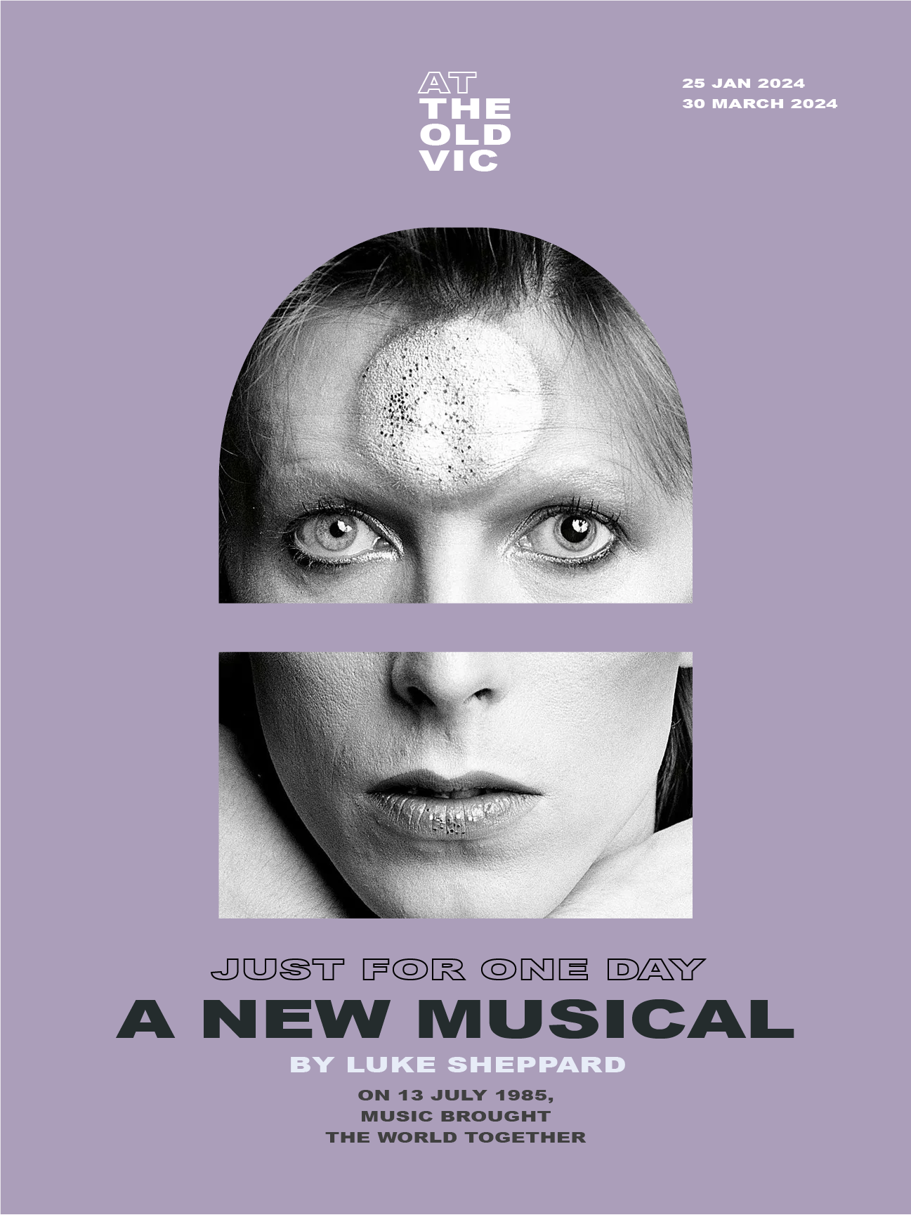
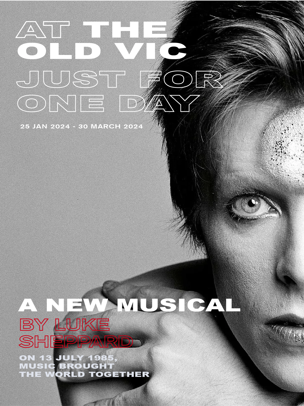
The Old Vic
Graphic Designer and Illustrator | Spec Project | Job Application
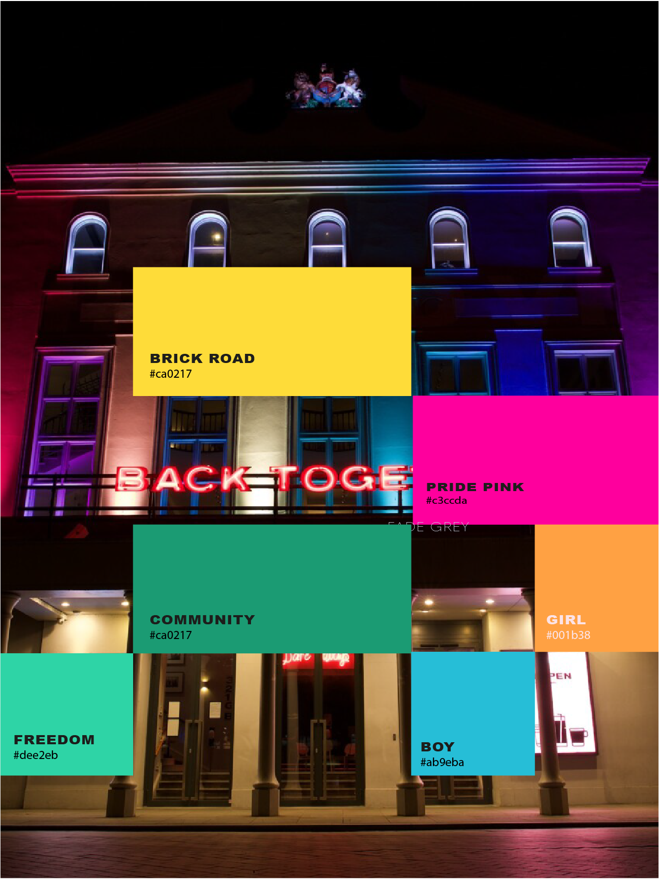
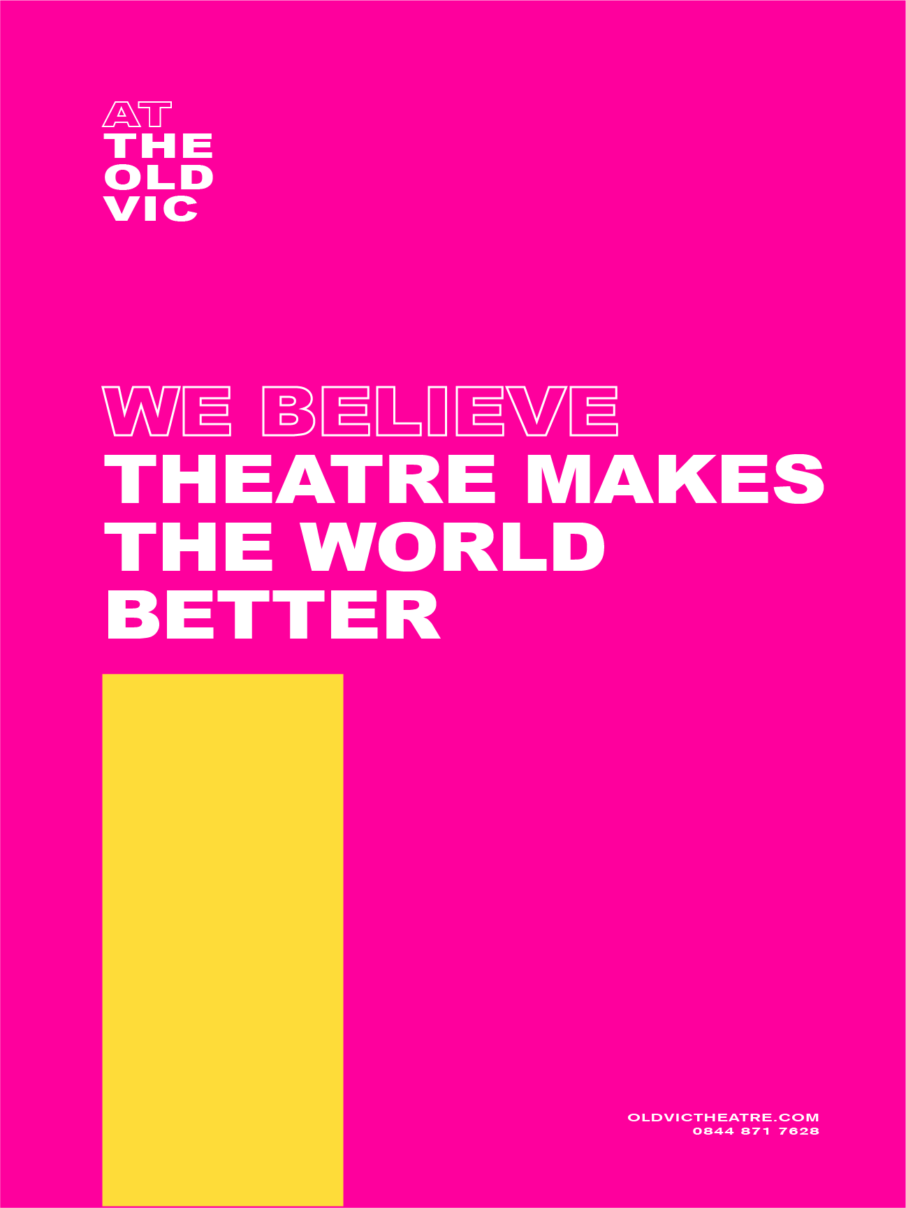
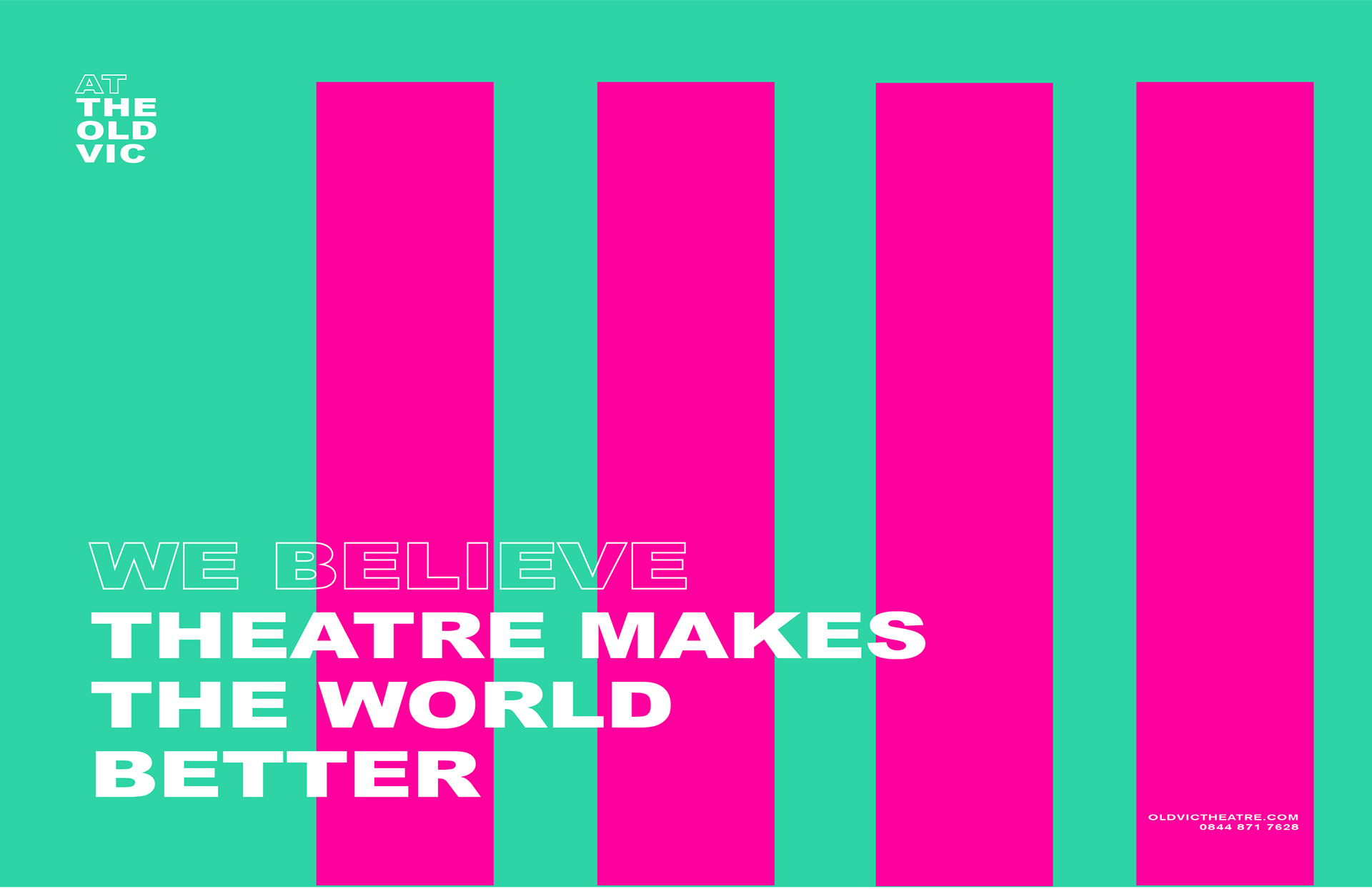
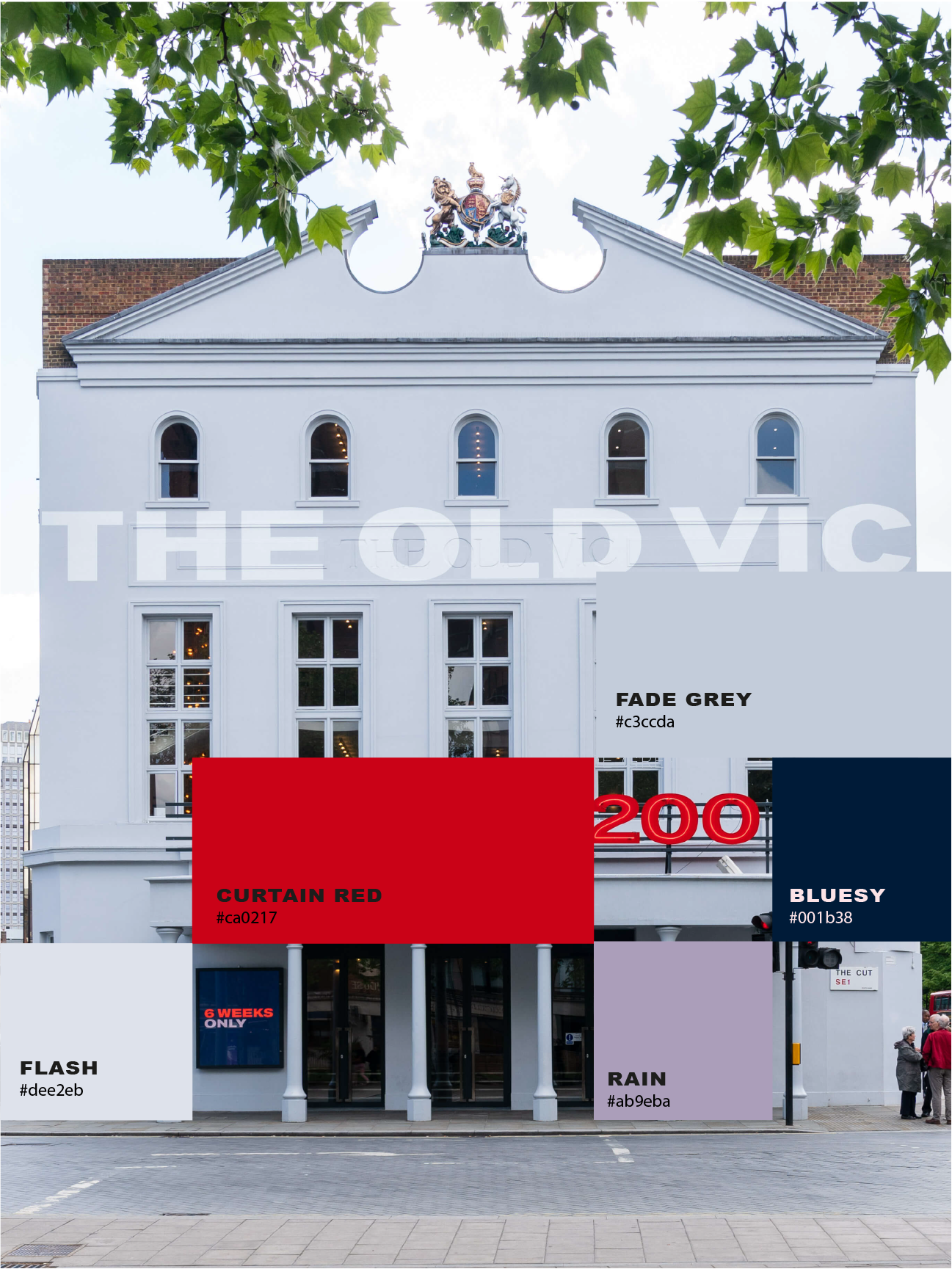
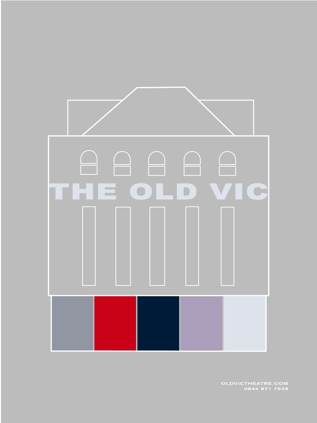
I started my research by looking at the colour palette of the building itself and the surrounding signage, pulling together a uniformed palette to inform my design choices. I then created simple line illustrations and used these shapes to form a brand identity roll-out that works for both print and digital assets.
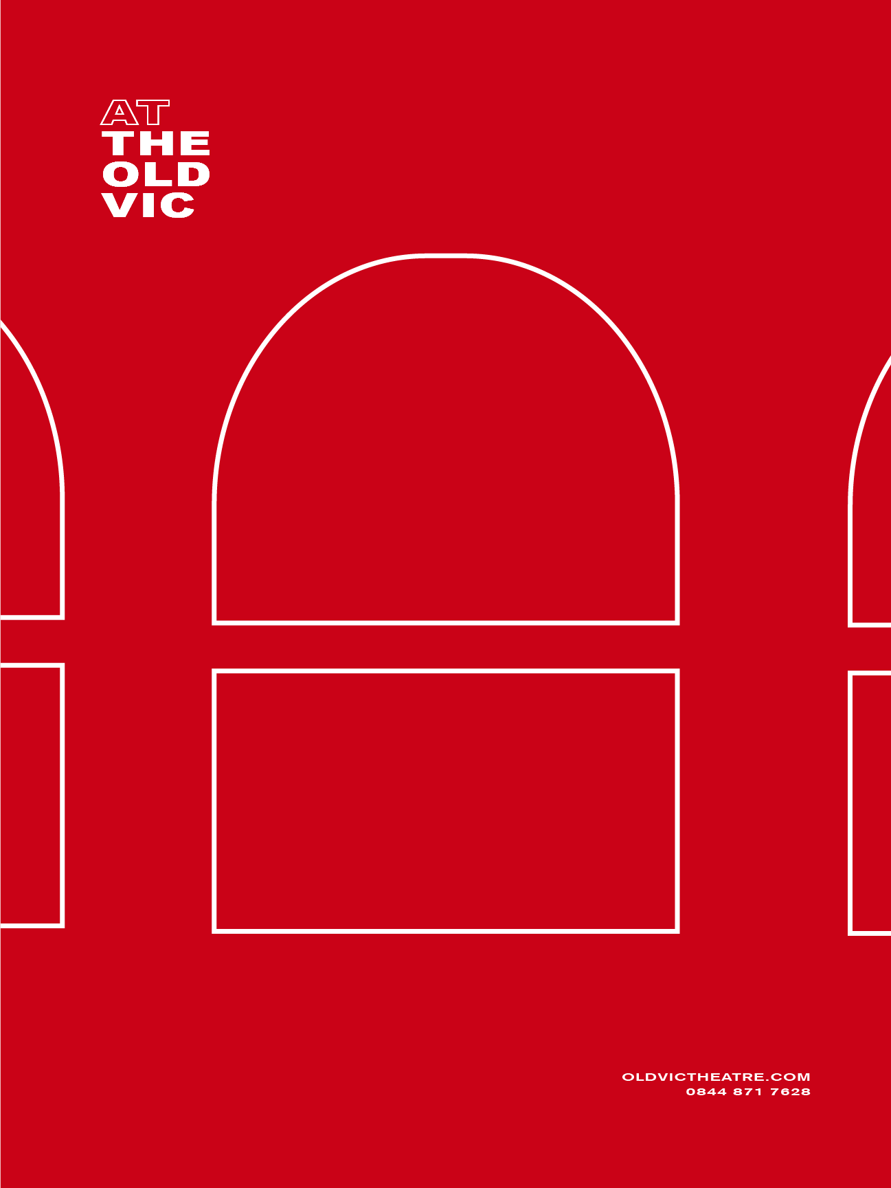
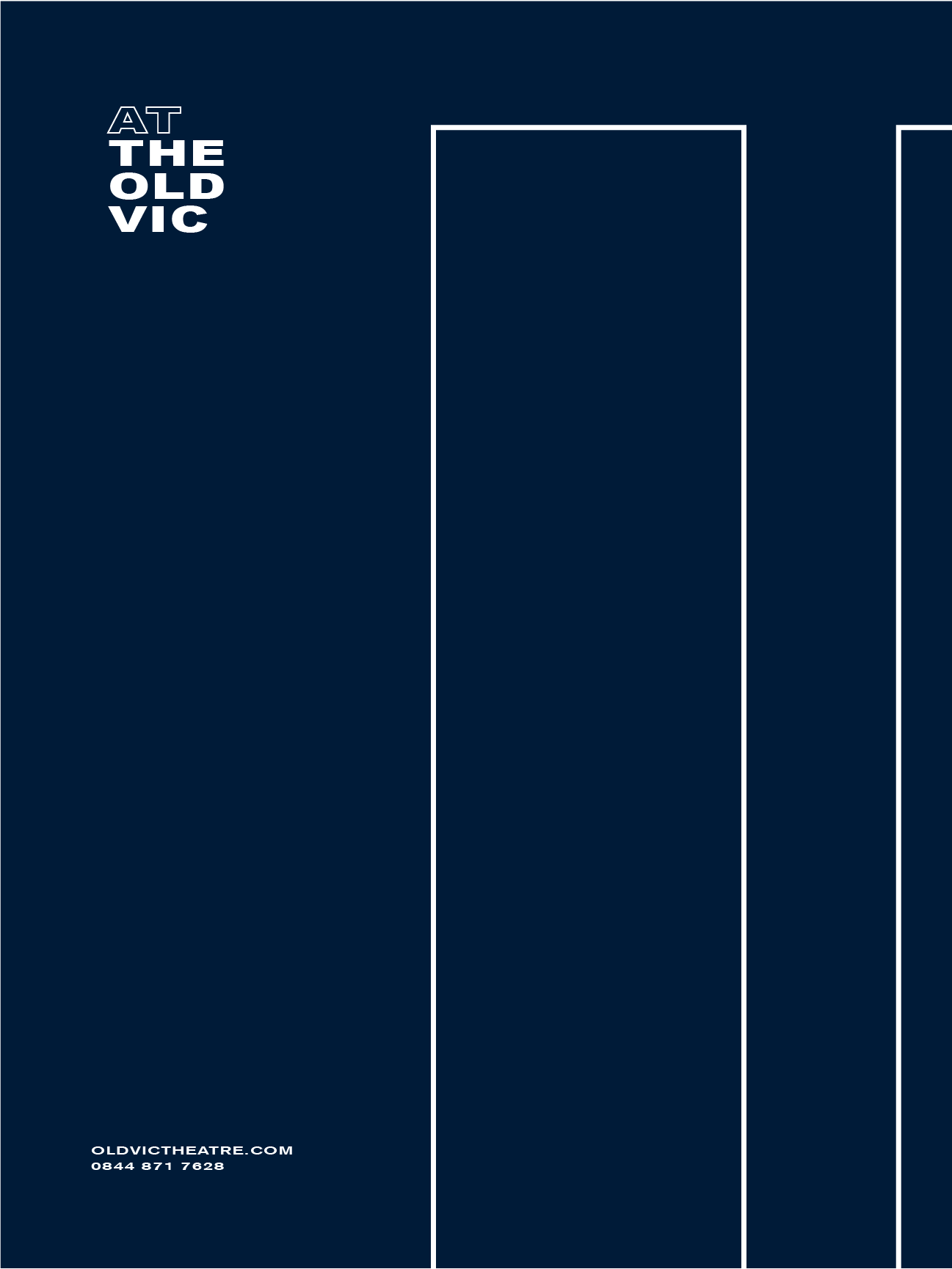
I inverted the shapes using a photography fill with social media asset usage in mind. The outline text of the original logo works well with this outline/fill direction.
I looked at photographs of the building at night, using a colour palette that draws on the current rainbow lighting during Pride week. I used the same simplistic line drawing template to roll-out an alternate campaign to appeal to varied audience.